Atlas notes
GT Atlas is where General Translation publishes long writing. Each story is an issue of a magazine, with a cover, art and colors of its own, and it reads as a magazine feature.
These notes give the reasons for a magazine and show the magazine as it stands. Then come the shelf it grew from, kept to explore, and the shelf’s three ways of setting a story: the docs reader, Fumadocs’ own interface and a printed book. The covers, Taylor Fang’s seven directions for the cover and the languages follow.
Why a magazine
Our long posts carry many figures, and the blog sets every figure in the text column. A reader scrolls past each picture to keep reading and loses the paragraph that explains it.
A figure in Atlas can be live: the table of contents, the corner radii and the hit list from the docs essays are rebuilt in the page, so the reader can use what the paragraph describes.
The first model was Stripe Press: a shelf of books, each with a cover designed for it. The magazine keeps a cover for every story and sets each one as a feature, with its own art, headline and colors.
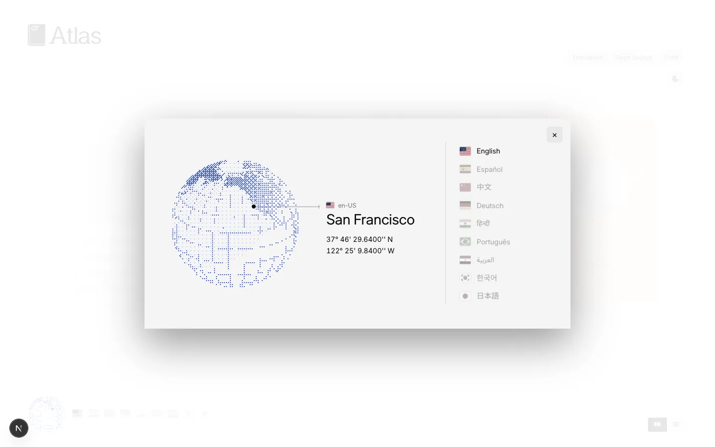
General Translation translates software, so the magazine reads in nine languages. The flags under the shelf set every title in the reader’s language, and the globe shows a city where each language is spoken.
A story takes its look from its subject. In the magazine each story’s colors and drawings come from what it is about; on the shelf, Fuma Nama’s profile was set in Fumadocs, the interface he made, and the history of Euclid’s Elements as a printed book.
Atlas is one module, src/app/atlas/(magazine)/_atlas in Prototemplate, with its own type and colors, so gt-cloud’s Atlas app serves the same module at generaltranslation.com/atlas without the hub around it.
The magazine
Every story keeps its own layout and type (the docs reader, Fumadocs’ own look, the printed book) and takes the magazine’s text over them: a drop cap in the story’s own color (Euclid’s N cut out of a vermilion seal), the story’s mark over each section head, and its headline in its own hand. As in a New York Times story, the stage beside the text is the page’s own paper, the stage changes by itself as the reader reaches each figure, and a short scroll past each section brings it in as one slide.
The marks are drawn for each story. Euclid’s three sections open under the drawings of its three opening slides in turn (the first construction of Book I, Ricci’s road from Macau to Peking and the gougu figure), Designing docs under the docs page as stacked panels, Rewriting docs under a proofreader’s caret, and Fuma Nama under the line of a Fumadocs table of contents. Designing docs sets the people it is for in its color’s italics, and Rewriting docs sets “and agents” into its headline over a red caret. Euclid keeps Taylor Fang’s book and opens on her slides: the title page, then the epigraph, then the story.
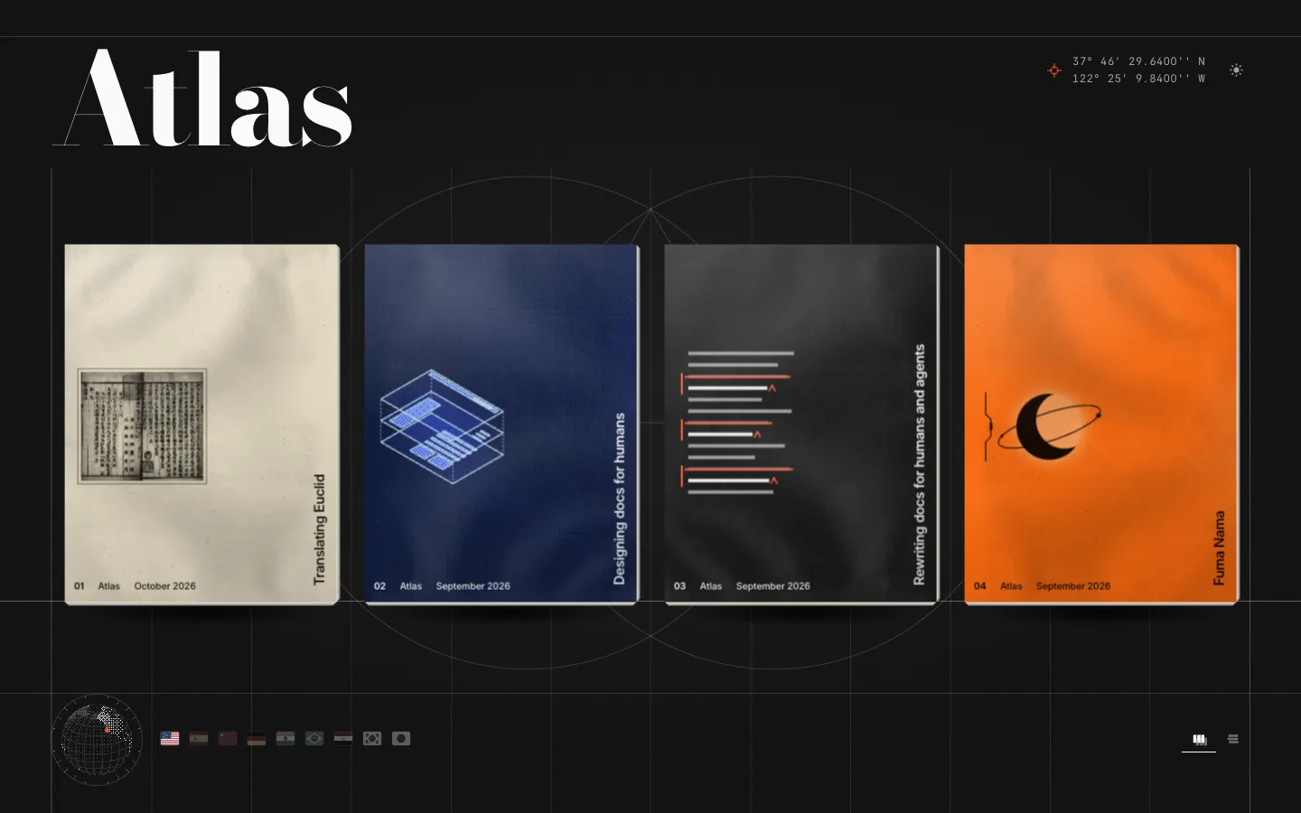
On the front page each story is a thin magazine in the form of Riffle, the first of Taylor Fang’s directions, printed on the story’s own stock: its cover’s colors, marbling and design, with the folds, specks and grain of a scanned sheet over them, its name up the right edge in Katagami Text, and the folio at the foot. A click opens the story. Lifting a corner shows the inside page, a survey sheet of the story’s place drawn from the globe’s land at a dot to the degree in the magazine’s own colours, its legend and scale bar where the corner lifts (Ricci’s road from Macau to Peking for Euclid, Hong Kong for Fuma Nama, San Francisco for the docs essays), and a click on the lifted corner opens the magazine itself over the hall: a click on the right page turns it, a click on the left page turns it back, as do the arrows under it, each leaf one rigid sheet turned by the compositor in under half a second. The magazine holds the whole article, fetched as the corner lifts and set on a Swiss grid after a printed museum magazine: an opening spread of the story’s picture across the gutter over the headline and the deck, with a legend at its foot as a map’s (an inset map of the story’s place beside the issue, the byline and the date), then every paragraph, list and note in two columns with a drop cap under a running head and over a folio line, and each picture placed by its shape: to the edges over a band for its caption, on a page of its own inside the margins, in a band across the top of a page, in a whole column beside the text, or within a column. Every line is in Katagami Text and Katagami Serif. The front page is drawn over a layout sheet whose guides are measured from the page: each magazine’s sides and top, the horizon its leaves stand on, the nameplate’s cap height and baseline, and the globe’s centre, with Euclid’s first construction faint behind the middle magazines. The guides run the sheet’s full width and height in one ink, and grid references letter each magazine’s column and number the rows between them, as an atlas indexes a sheet. The nameplate takes its size from the globe’s dial, so the imprint’s right side and the globe’s centre stand on one guide. The nameplate is the book imprint drawn in lines of one weight, exactly as tall as the capitals, then Atlas in Katagami Serif at its regular weight, with the view and theme controls opposite it in the cell the guides draw there, three parts between hairlines; along the foot run the globe with the languages round its dial, the chosen one at its right (under the pointer the others stand out round it, and a pick turns the ring until the chosen one is at the right), and, in the cell between the lines over and under the globe, the city the reader is in with its coordinates, as the host’s edge reads it from their address (San Francisco until then, or where it cannot say).
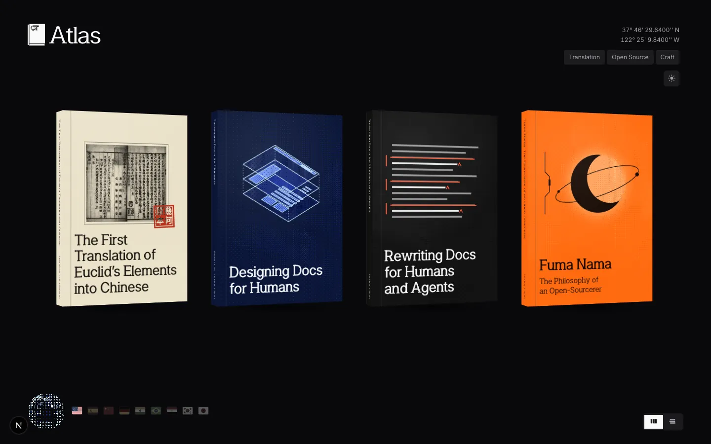
The shelf, the direction before the magazine, is kept to explore: the same stories as hardcovers on one shelf, read in the same looks without the magazine’s text.
- The shelfGT Atlas before the magazine: each story a book on one shelf, read in a look of its own.
The docs reader
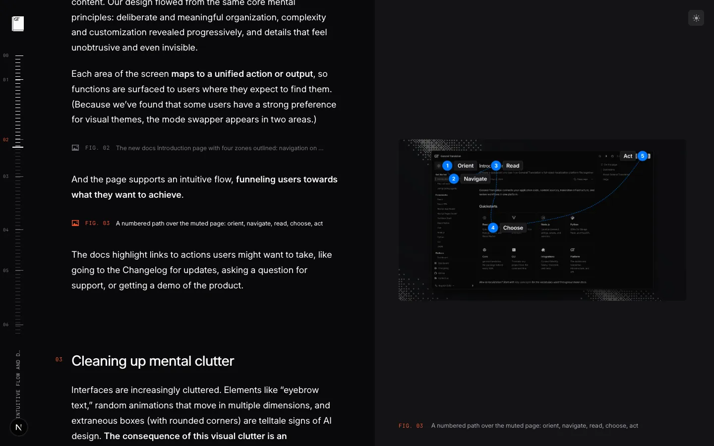
On the shelf, the two docs essays use the split reader: the text on the left, a stage on the right that shows the figure the reader has reached, and a rail of ticks at the left edge that marks each section.
A figure with several views has a slider in its foot, a pill whose labels show through the thumb as it passes. The stage opens on the story’s live cover.
Fumadocs’ own look
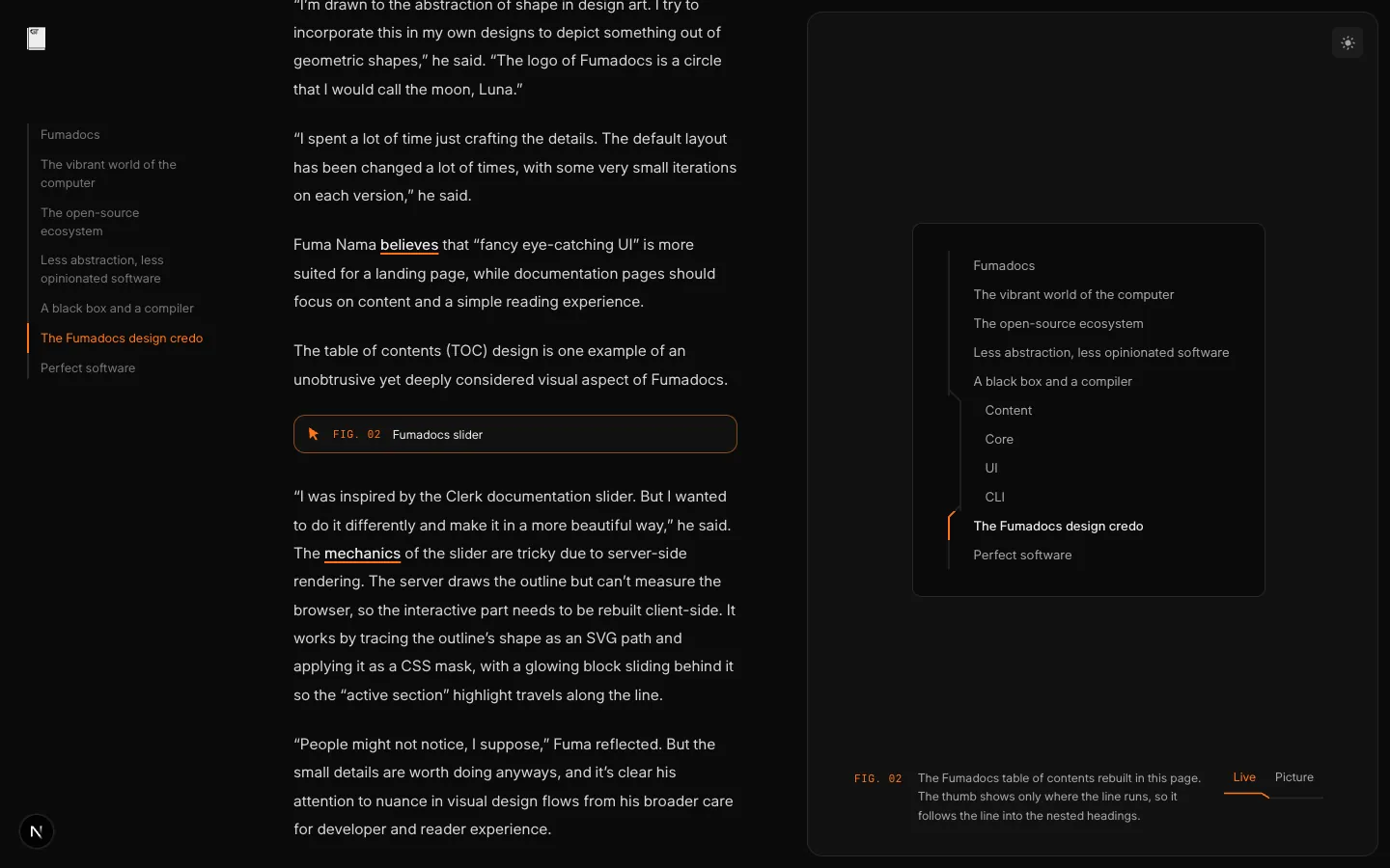
On the shelf, Fuma Nama’s profile is set in the interface he built: Fumadocs’ neutral greys, sans text, cards with a hairline border, and his orange.
His table of contents replaces the rail. It is the one Fumadocs ships: a line down the headings, drawn as an SVG path and used as a mask, so the orange thumb shows only where the line runs and follows it into the nested headings. Every slider in the story is drawn the same way, as a stepped line under its labels.
A printed book
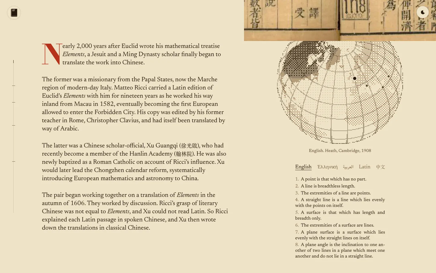
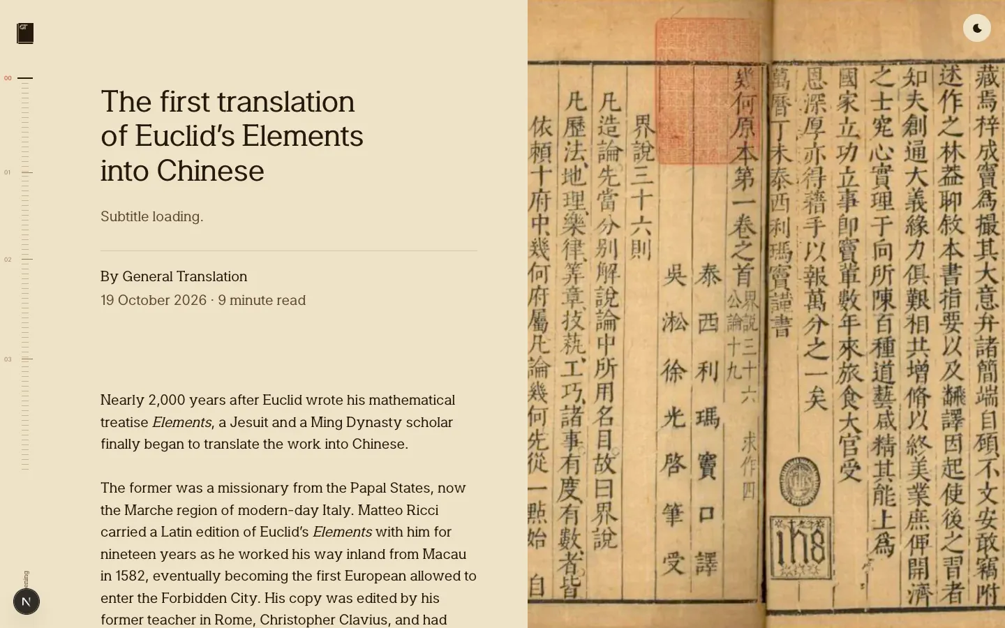
On the shelf, Translating Euclid is set as the book it is about, by Taylor Fang: light brown paper taken from the cover scan’s own paper, one serif face (Katagami Serif), a title page, and a stage beside the text for its pictures.
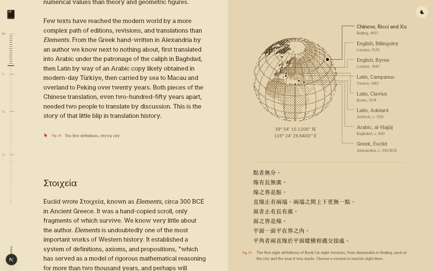
On a wide screen the text keeps to the left 61.8% at a 620px measure and the stage holds the rest: the cover, then each of the story’s 21 pictures with a short caption that links to its source, fading from one to the next as the reader reaches the paragraph about it. The stage empties at the sources. Notes sit in the margin level with their numbers, and on a phone each picture and note follows its paragraph.
It is still the shared reader, with the same theme switch, monogram home and crossfade from the shelf as the other stories. The first figure shows the first eight definitions of Book I in five versions, English, Greek, Arabic, Latin and Chinese: the globe turns to each city in turn every six seconds until the reader picks one.
The covers
Every cover has a design of its own over the same ground: Glyphfield’s Fluid Energy, run on WebGPU and printed through a one-pixel Bayer dither in the cover’s inks. The title sets in Katagami Serif at the foot, and the authors are on the spine.
Translating Euclid is vellum, with the 1607 Jihe Yuanben page in full ink and a vermilion seal reading 幾何原本.
Designing docs for humans is cobalt, with the docs page exploded in isometric as sky-blue lines over dithered panels.
Rewriting docs for humans and agents is a graphite proof sheet, its edits marked in red.
Fuma Nama is orange, with Luna, the Fumadocs moon, drawn as a crescent, an orbit and his table of contents line.
Seven cover directions
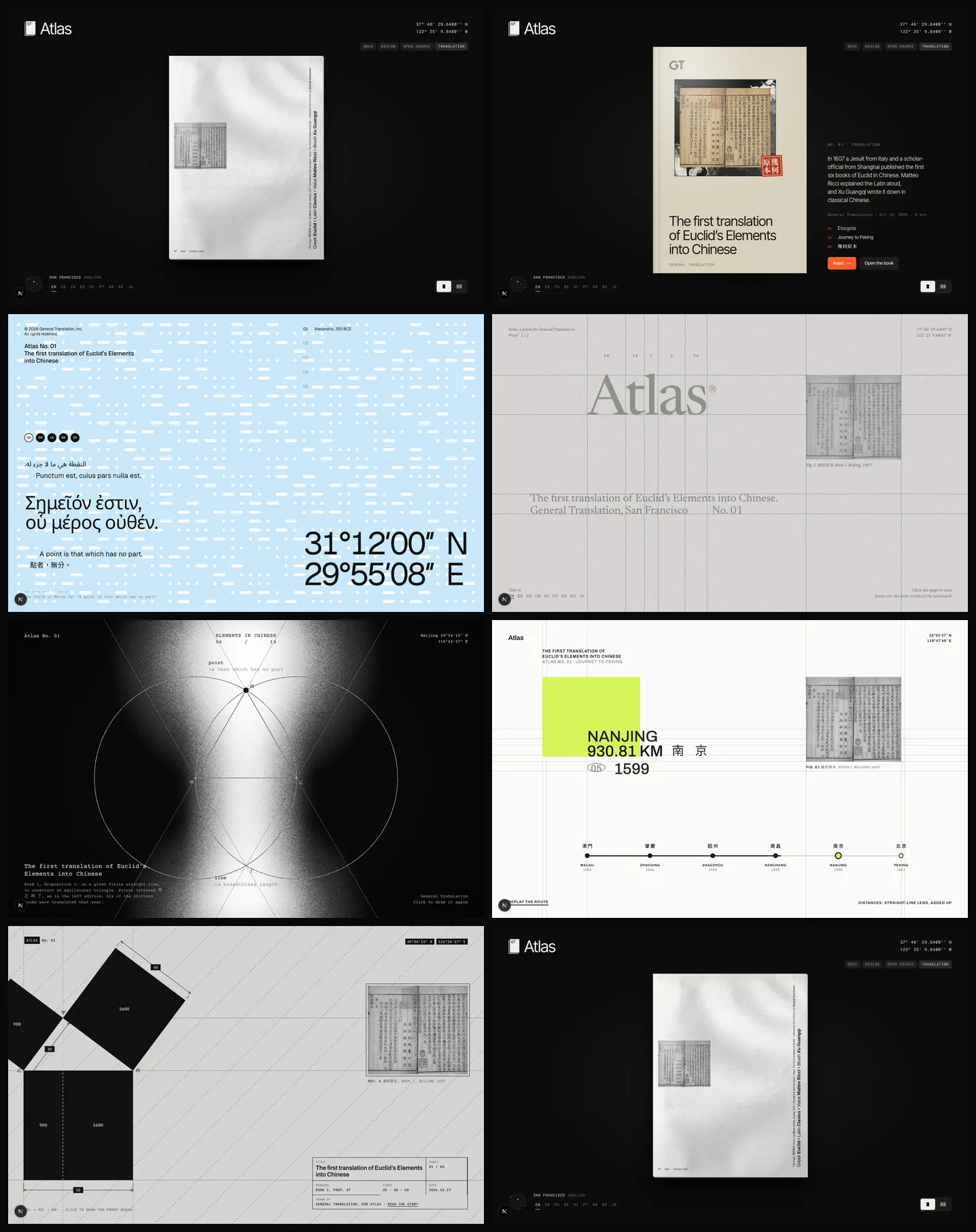
Taylor Fang drew seven directions for opening Atlas on a single issue, the first Chinese translation of Euclid, as one cover that fills the screen. Each has its own page under /atlas/directions, and the number keys move between them.
- RiffleThe issue as a thin paper magazine on the Atlas shelf. A click riffles every page past, and a scroll turns one page at a time.
- Atlas bookThe Atlas shelf reduced to one book, which opens on Book I as it was set in 1607.
- SignalA General Translation poster: a Morse field, the first definition in five languages and the coordinates of each city.
- Proof posterA printer’s proof: grey type, construction lines at the letter boundaries and a second page of definitions.
- Light posterA column of light and film grain behind Book I, Proposition 1, drawn with a compass and lettered as in 1607.
- RouteWayfinding signage for Matteo Ricci’s road from Macau to Peking, with a sign that changes at each stop.
- MeasureA drafting sheet: Book I, Proposition 47 in heavy black, dimensioned 30, 40 and 50, with a title block.
Languages and places
The flags under the shelf set every title in one of nine languages. Each language has several cities where it is spoken, and picking a language again moves to its next city, so no language is pinned to one country.
The coordinates in the corner change with the city, digit by digit like a split-flap board. The globe beside the flags opens into the locator: the globe with its coordinate lines, a leader from the city to its locale, its name, and its latitude and longitude on a line each.