The name
General Translation was chosen deliberately, in this order. First, ambition: like General Motors or General Electric, the name says we intend to be the trustworthy, technologically innovative number one in the category, an enterprise in the old sense. Second, generality: a reference to artificial general intelligence. General models outperform specific translation models because they understand context and can be directed. Third, distinction: every other localization company seemed to begin with an “L”.
The idea
Every product in every language.
Native-level speed and quality, from day one. A simple idea, executed insanely hard. The positioning is the Vercel of localization: two halves designed together, open-source developer tools (the gtlibraries) and closed-source infrastructure that is the best-in-class way to use them. Because we build the entire stack, we can promise what point solutions can’t: consistent, high-quality translation across a whole business, integrated in an afternoon.
Two registers, one family: the open source should feel community-owned; the platform should feel enterprise-grade.
- Engineering-first. Built by people with deep technical roots, for the world’s best engineering teams.
- Craft. We care about the difference between drawn-once and drawn-twice lines. That is literal: the line law audits every page.
- Infrastructure-grade. Reliable, fast, secure. Something an enterprise stands on, not an app it tries.
- Cosmopolitan. Urbane, sophisticated, connecting the world and its languages. Language is our material, not just our market.
- Hand-crafted. The brand reads as made by people who care, not assembled from a template.
The character
The brand carries itself like a fullstack director: it writes the script and it pushes the camera. Creative and technically innovative, never one without the other. On time, under budget, over-delivering, always working with the best people, with a keen sense for making things people love.
Personality
Aesthetic
Positions are read from the completed system. They are working answers, for basement to confirm or push.
Voice
Measured, declarative, precise, quietly confident. Every sentence is complete and makes one claim. A caption states the mechanism: “A framed cell has a 1px padding reveal that shows the ground underneath, so the cell draws no border.” Copy uses no exclamation marks, no hedging and no marketing adjectives where a fact would do. Wit is allowed when it is precise. Technical terms are used precisely and sparingly. The register sits closer to a well-written spec or a good engineering blog than to marketing copy, and the copy is about the product.
Translations are generated at build time and deploy with the app.
Supercharge your global growth with cutting-edge AI!
The mark
Every stroke of the GT monogram is two parallel lines: the doubled-line grammar at brand scale, the same device that runs through every diagram in the system. The mark renders in one ink, either ink on paper or paper on ink. Never a third color, never a gradient, never a shadow. The dark surface inverts the drawn mark’s ink. In illustration systems the mark renders as an alpha mask, so the shape takes the surface’s ink. The one sanctioned flourish is the Bayer-dithered specular shimmer, never a GIF and never a glow.

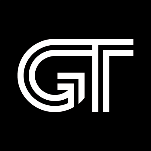
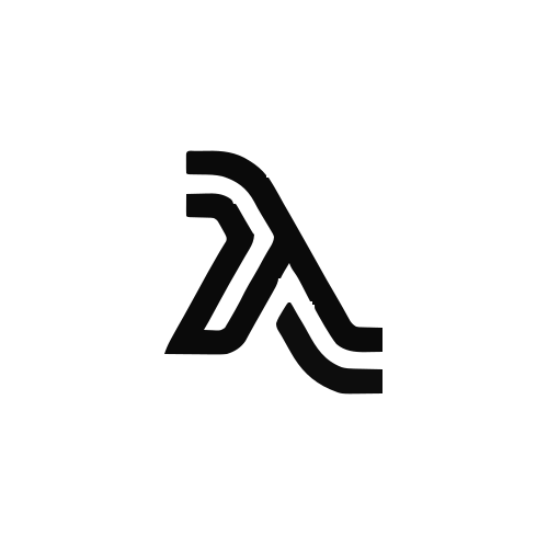
At text size the wordmark sits inline with prose, at the cap height of the line it lives in, the way the hero on generaltranslation.com sets “GT builds full-stack localization for apps, docs, and websites”.
The identity must survive compression: a favicon, a CLI banner, a README, a syntax-highlighted code block. Developers meet the brand in a terminal as often as on a website.
Color
Four absolute colors, one spectral accent per page. Structural color everywhere derives from the four as alpha steps: every text step is ink or white at some alpha, every hairline titanium at some alpha. Dark mode is a pure token remap, one surface family in the dark, the way light mode is one white. The accent is a controlled edge, never a wash. Depth comes from lines and material, never shadows.
One per page. The working accent is the toolchain blue; a page may choose its own spectral band, but it only ever gets one.
Type
One face carries the brand. Inter is the display, interface and text typeface: headlines, interface chrome, captions and long-form reading are all set in it. The build is the rsms.me variable Inter (version 4.1, roman and italic, with the optical size axis), self-hosted rather than loaded from Google Fonts. Headings use weight 500 at most. Long-form text is set at weight 400. Monospace is an instrument voice for code artifacts (tokens, terminals, file paths, small labels in technical diagrams and product UI) and appears nowhere else; even those labels are avoided where possible.
The identity is multilingual-first. Headlines, UI and marks must hold up in CJK, RTL and Indic scripts as well as in Latin; a wordmark or layout that only works in English contradicts the company. Inter covers Latin, Greek and Cyrillic, so text in other scripts falls back to the system face for that script, and every layout is checked in those scripts. Inter is the working typeface for the identity project. It is not a final decision; alternatives remain open if they bring credible CJK and RTL coverage or well-matched companion faces.
Every product in every language
Every product in every language
Every product in every language
Every product in every language
Every product in every language
Every product in every language
General Translation builds full-stack infrastructure for localizing apps, docs, and websites: i18n libraries, context-aware translation, and the platform that runs them.
The optical size axis adjusts the letterforms to the point size.
Language as material
The signature device: glyphs, characters that make up greater wholes. Writing systems are the raw material the brand keeps returning to. The sentence below is the reassembler running live. The headline dissolves into glyph dust and the same swarm becomes the next language.
A locale is named one way, everywhere: flag print first, code in the surface’s own mono. The prints are SVG, never emoji; a flag is a functional data chip, never decoration.
Every device above runs live, with its API, on the docs page.
Where it ships
The identity is applied on four kinds of surface today.
open generaltranslation.comopen the deckopen the filmsopen the marks
When in doubt about how the brand behaves, read the shipped surface the work belongs to.
The site grew from the direction of the Dossier, which stays in the gallery with the other directions as the working record of how we got there. From 2026-08-06 to 2026-10-07 this section named it the completed reference for the brand.
Made with the system
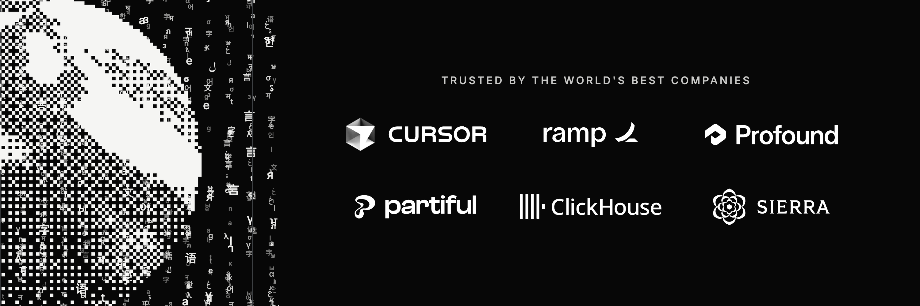
Finished artwork produced with this toolchain and the Glyphfield studio, kept here as proof of what the identity does off the page. The whole identity, this page included, is also summarized as a 93-slide slideshow at /deck.
Blog films
Each film is a HyperFrames composition: HTML on a seekable timeline, rendered frame by frame at 1920 by 1080 and 60 fps. The smoke is the gem smoke shader from Glyphfield, built on Paper Shaders’ Gem Smoke (Apache-2.0), in the colors of the post’s own cover.
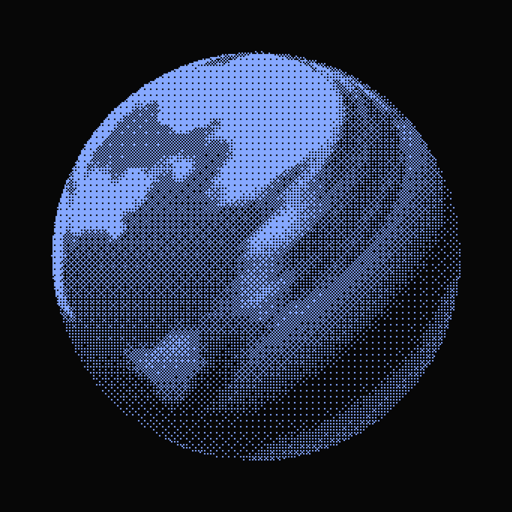
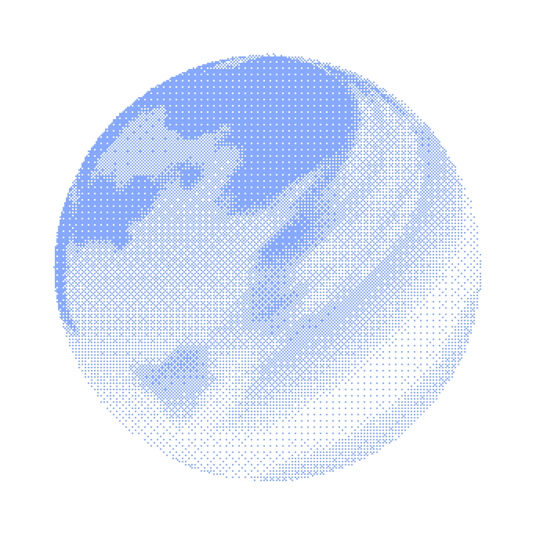
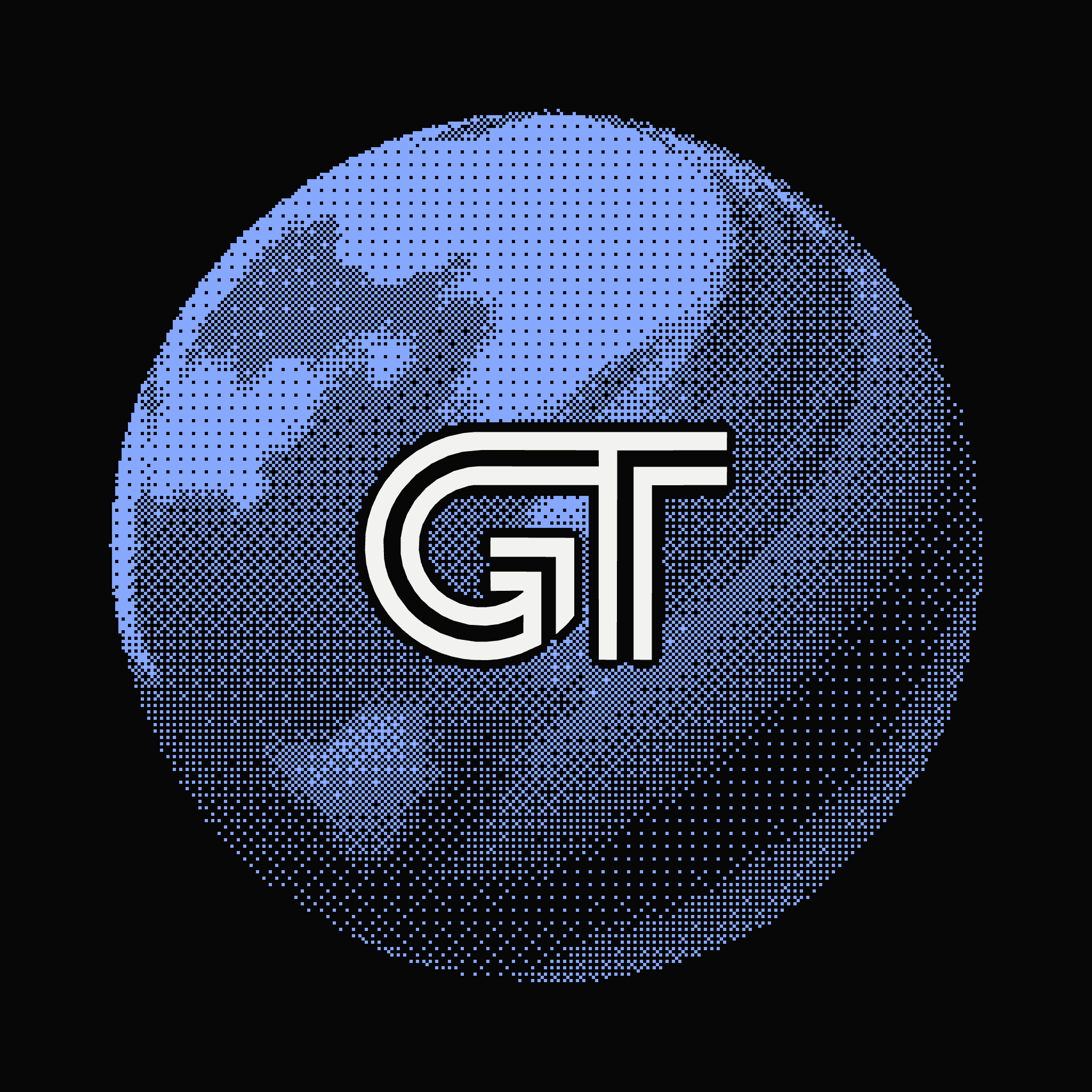
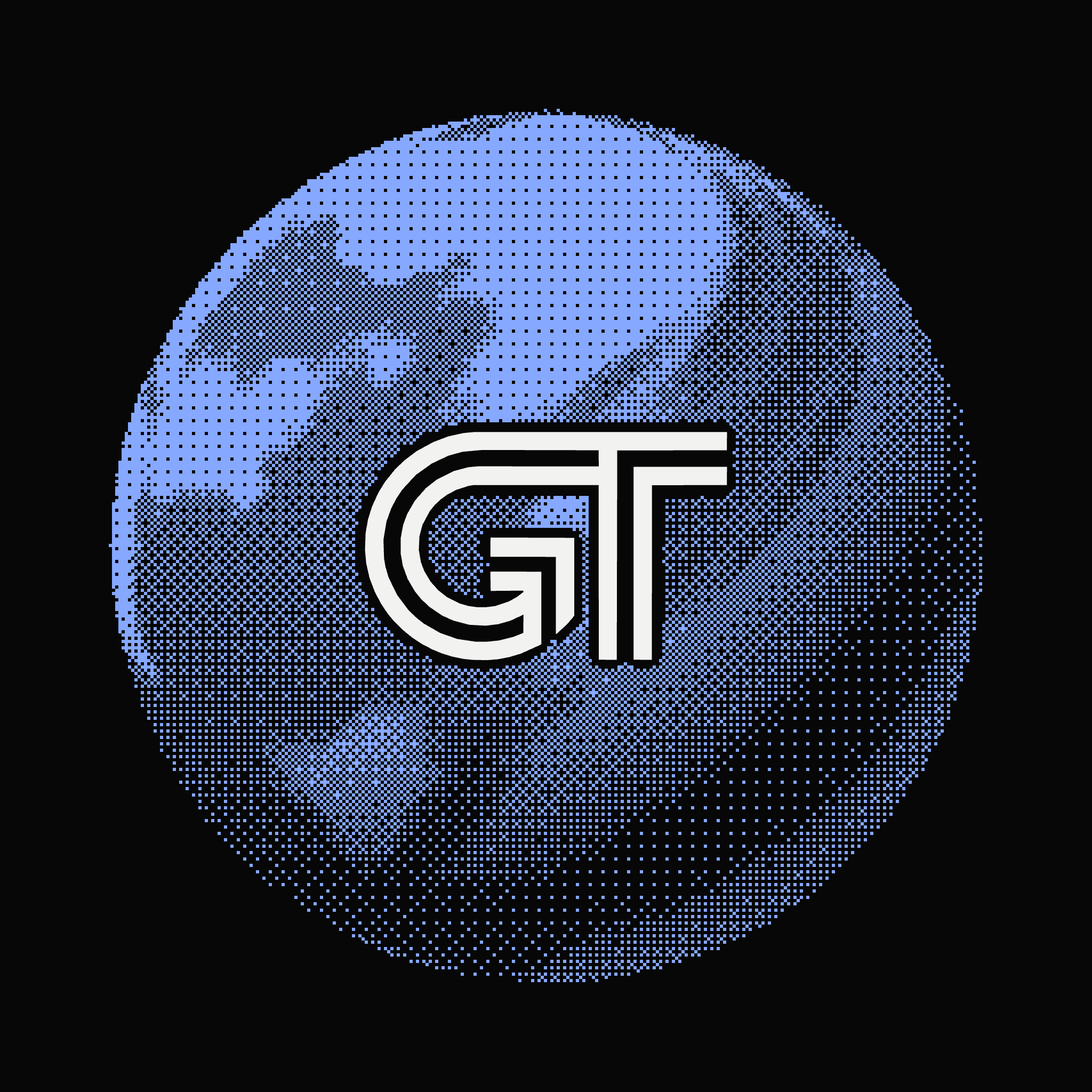
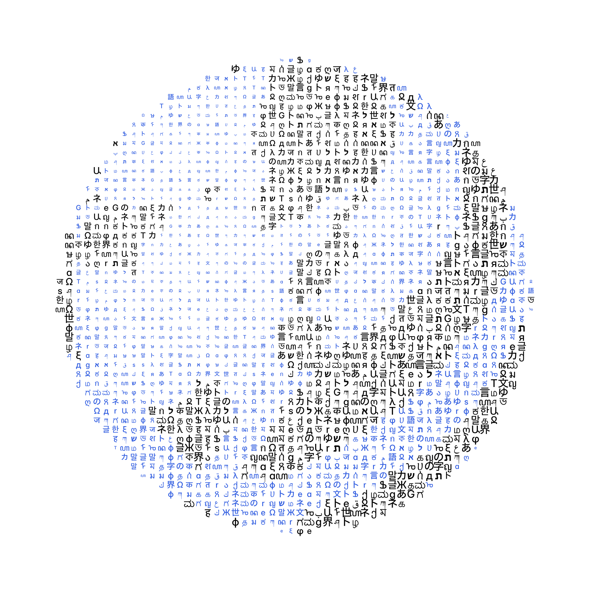
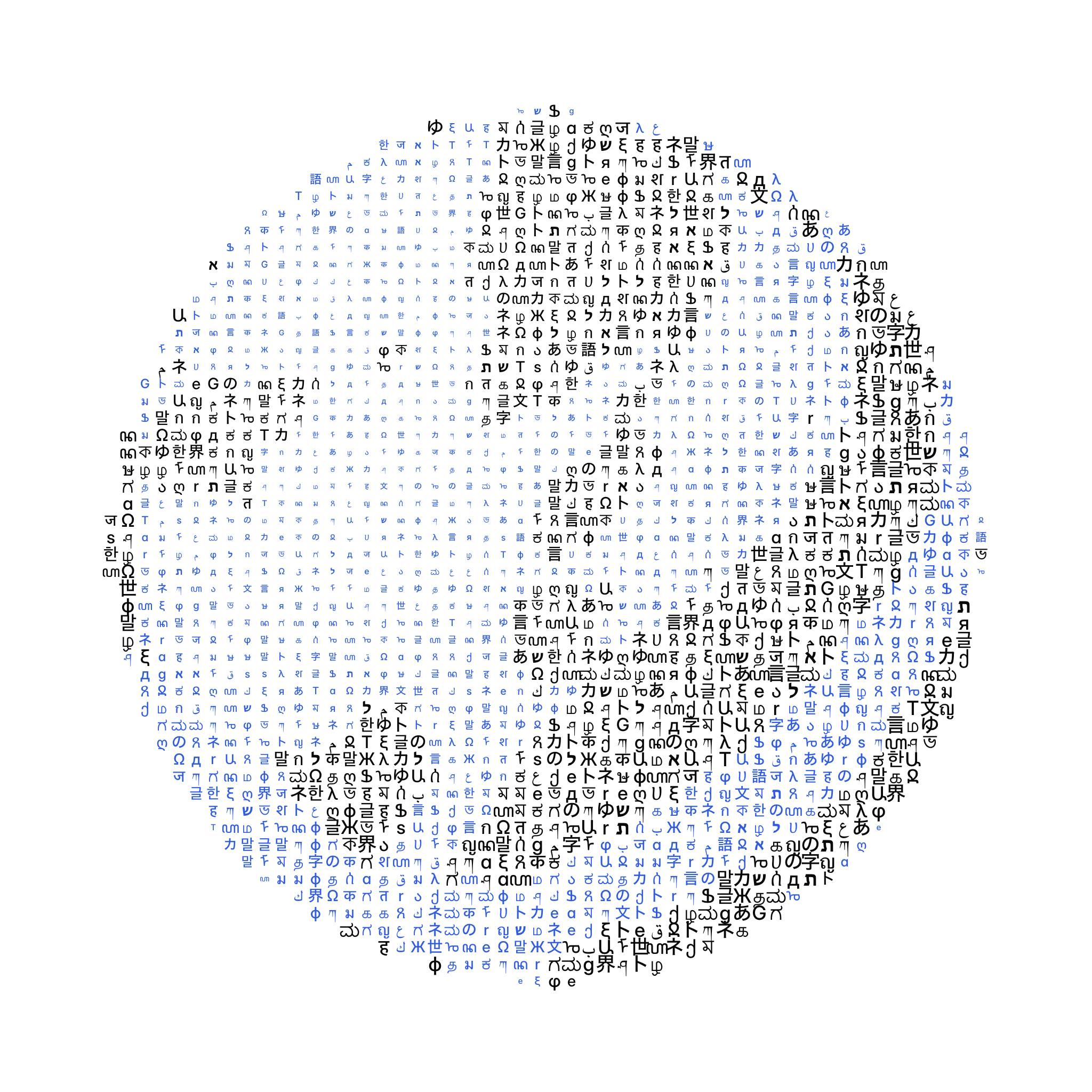
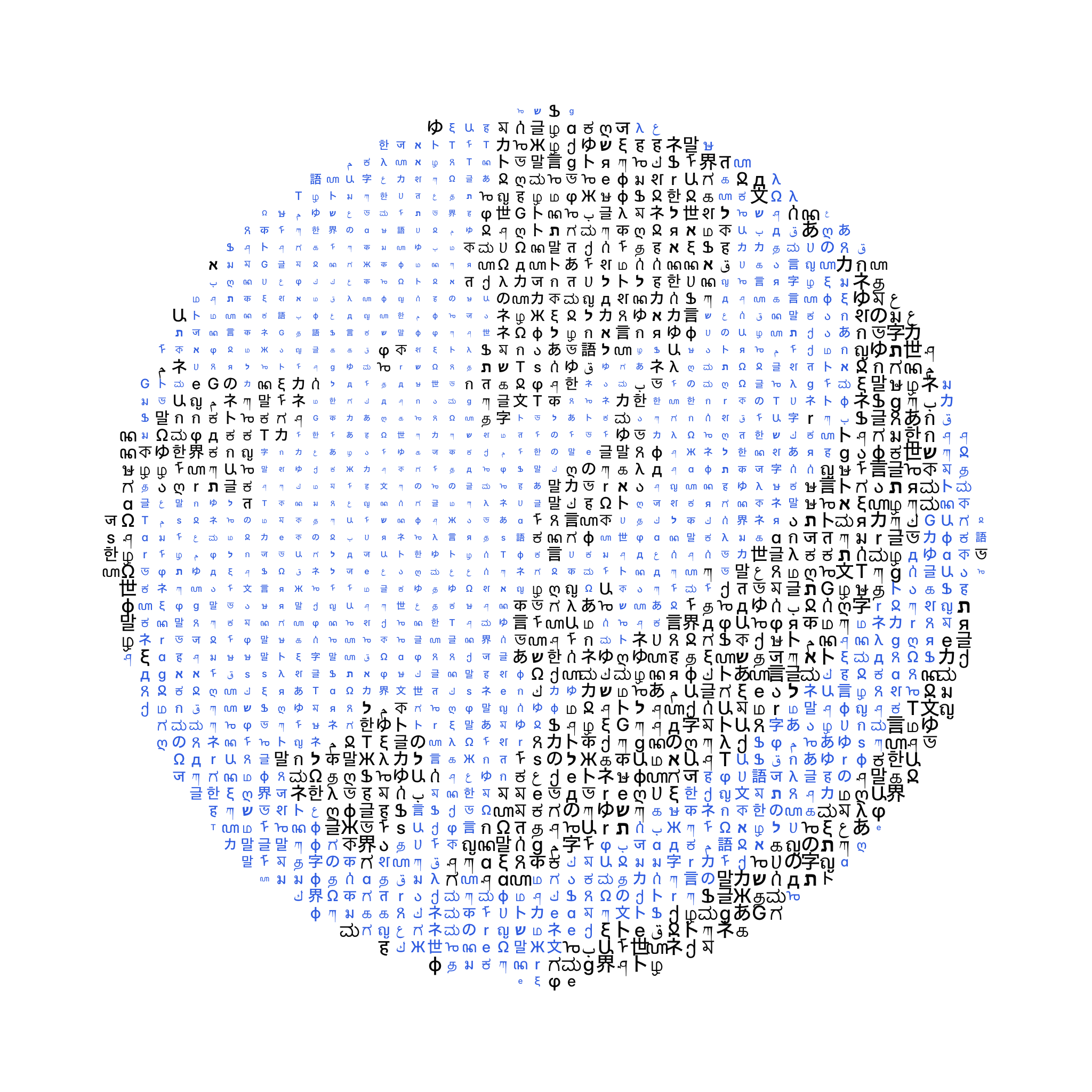
Partnership globes
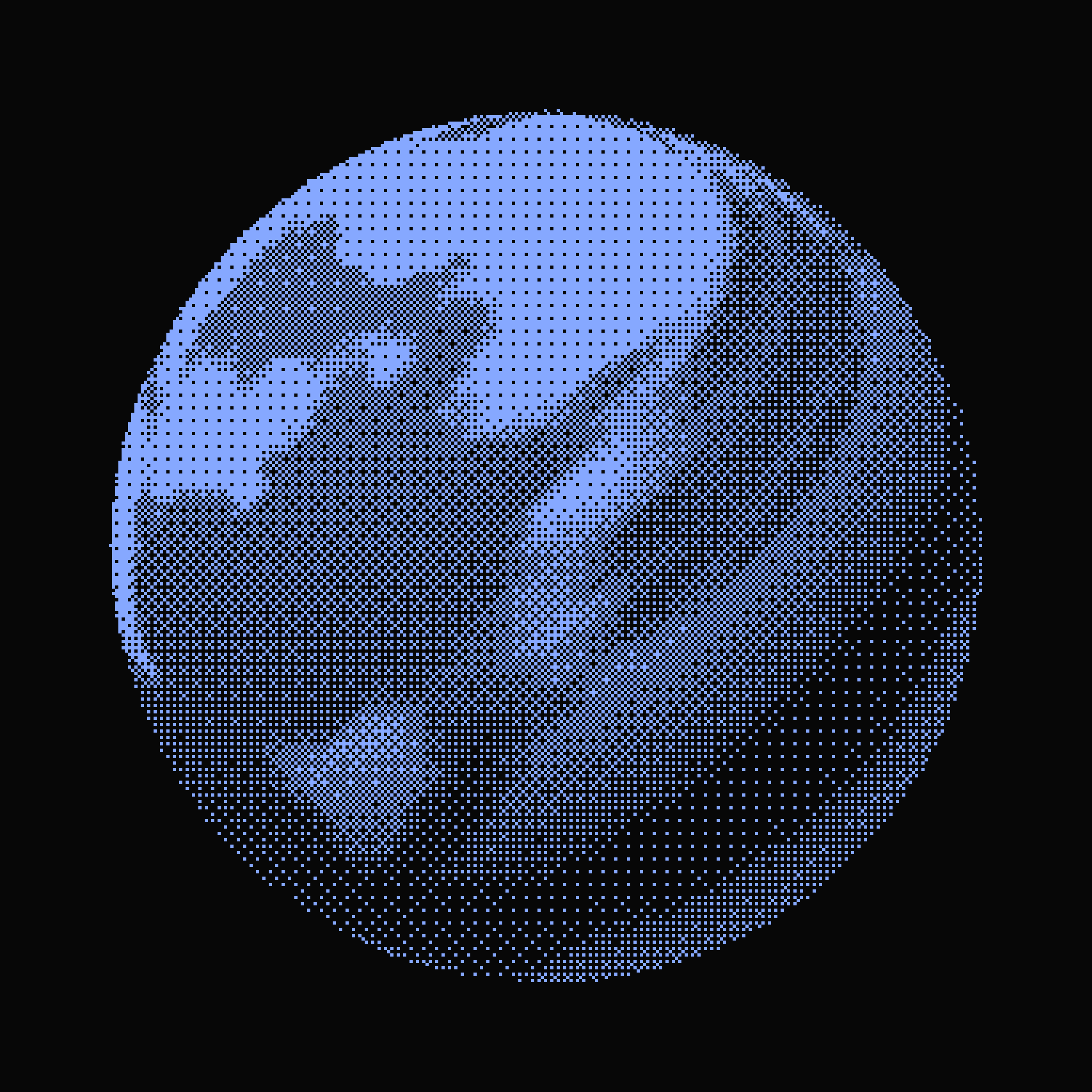
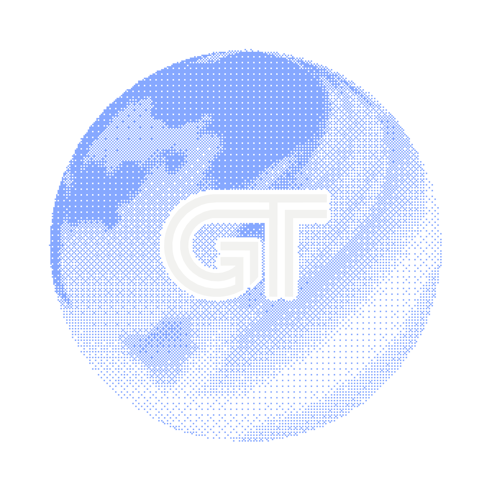
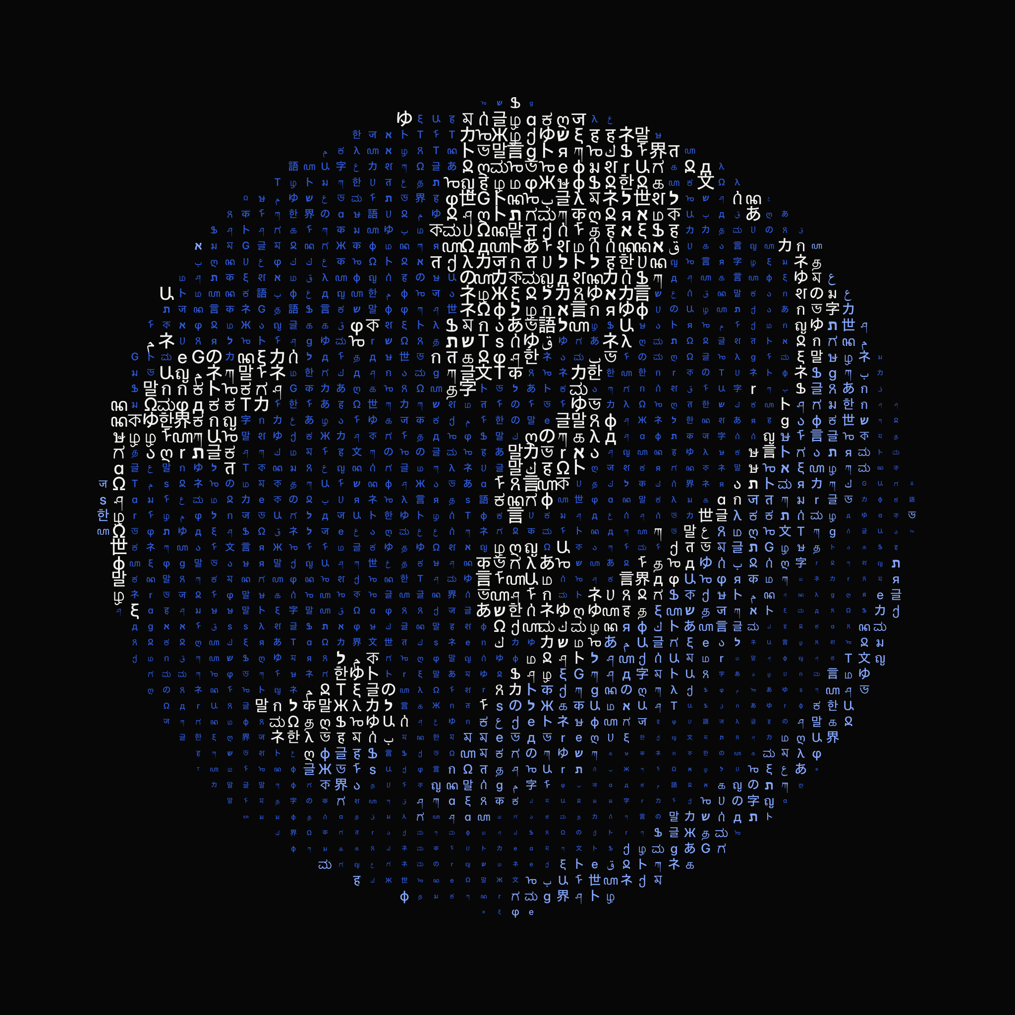
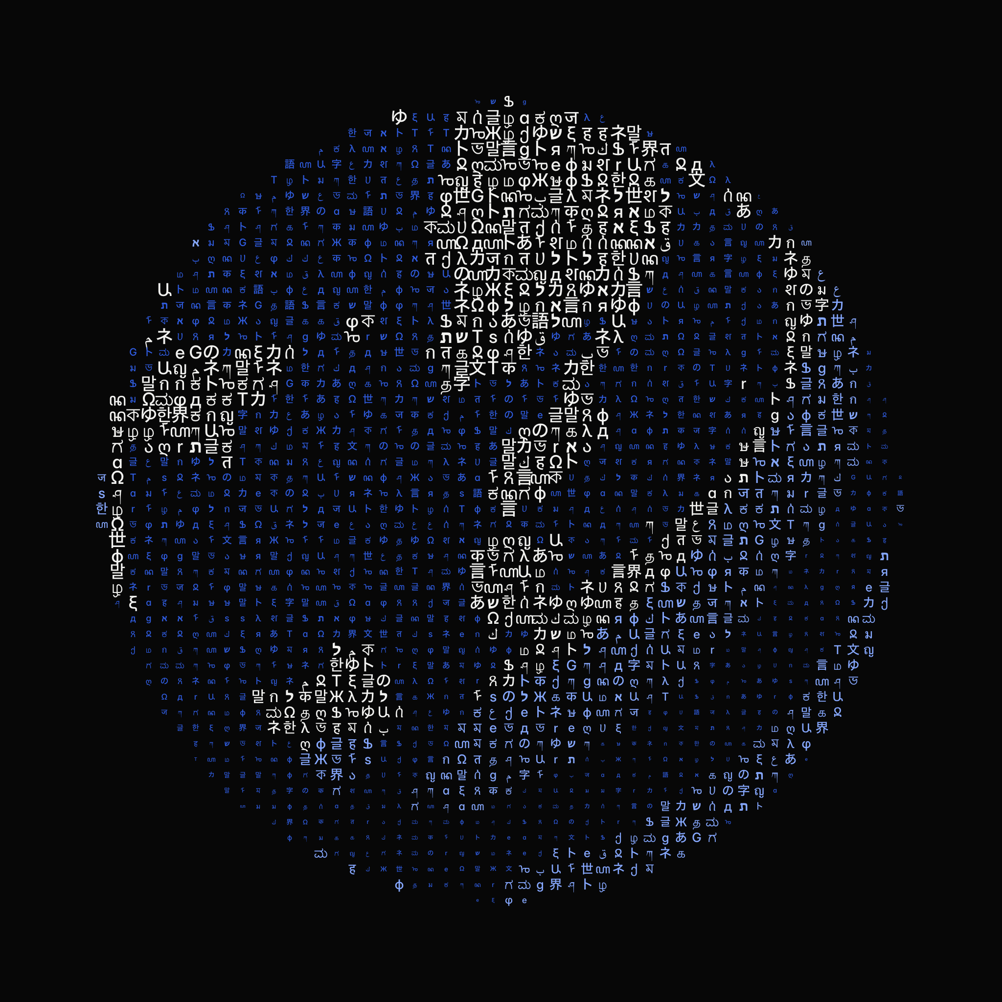
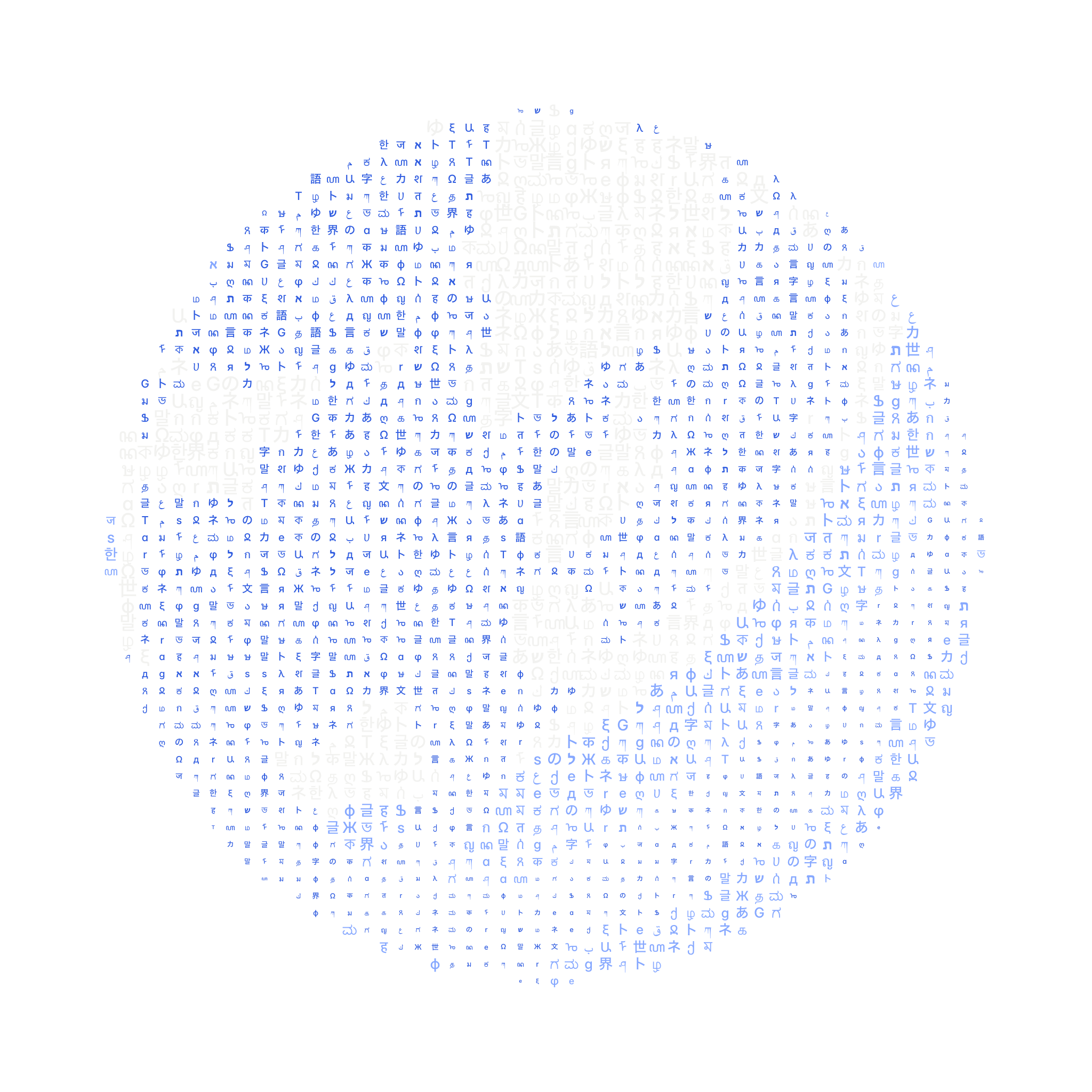
The globes are square graphics for laying beside a partner’s mark, each 2048 by 2048 px. The dark ones come on ink, #070707, and the light ones on paper, #ffffff. Each also comes as a transparent twin with the same art on an alpha ground: a dark twin is for a dark ground and a light twin for a light one.
Context for partners
The industry is AI developer tools: the full stack for localization, meaning i18n libraries, context-aware translation APIs, and the infrastructure for versioning, editing, and integrations. The audience is technical and product leadership at growth-stage companies; their engineering and growth teams are the users. Ramp runs GT across its dashboard, landing page and iOS, Cursor across web and docs, and Sierra across web and GTM. Against legacy, seat-based TMS point solutions, GT is usage-based and owns the whole stack, so it can own the whole experience.
Direction
International Style discipline with Art Deco’s future-embracing stance. Swiss grids, blueprints, boxes, no rounded corners. Water and ocean as the recurring theme, connecting the globe. Bespoke material textures, in the spirit of materialarchiv.ch.
References
Josef Müller-Brockmann and the Swiss poster tradition. Otl Aicher’s Munich 1972 pictograms. Vignelli’s subway map. Split-flap departure boards. Undersea cable maps and nautical charts. The Rosetta Stone. The Chrysler Building. Powers of Ten. Vintage National Geographic. Borges’ Library of Babel. The Whole Earth Catalog. Transit signage. NYRB Classics. Dieter Rams. Vintage Olympics stamps.
Admired
- Vercel, Resend, Stripe: reliable, developer-first infrastructure with engineering excellence.
Avoid
- Monospace as the brand voice in headlines, body, or marketing. Small mono labels inside technical diagrams and product UI remain instruments; avoid even those where possible.
- Smooth scrolling, scroll-hijacking, and inertia libraries. Native scroll everywhere.
- Robot and sparkle iconography for AI.
- The flag-soup cliche. Flags are functional data chips only, printed as SVG, never emoji.
- Iridescent AI gradients and glassmorphism.
- Eyebrow text that has not earned its place. Three stacked lines saying the same thing is noise; functional tags and labels are fine.
- Em dashes in rendered prose.